OVERVIEW
Audience
Northstar Lab Remote Employees
Responsibilities
Instructional Design
Prototyping
UX Design
Tools Used
Figma
MindMeister
Microsoft Office
ChatGPT
Storyline 360
THE CHALLENGE
Ambiguity—not knowledge—was the real barrier. New hires weren’t struggling with skills—they were s struggling with uncertainty. Early on, employees were expected to interpret vague tasks, communicate across teams, and make decisions without clear direction. While onboarding covered tools and processes, it didn’t prepare them for the gray areas of real work.
This led to:
• Misaligned expectations
• Rework and inefficiencies
• Delayed deliverables
The gap wasn’t what to do—it was how to respond when things aren’t clear.
THE SOLUTION & LEARNING OBJECTIVES
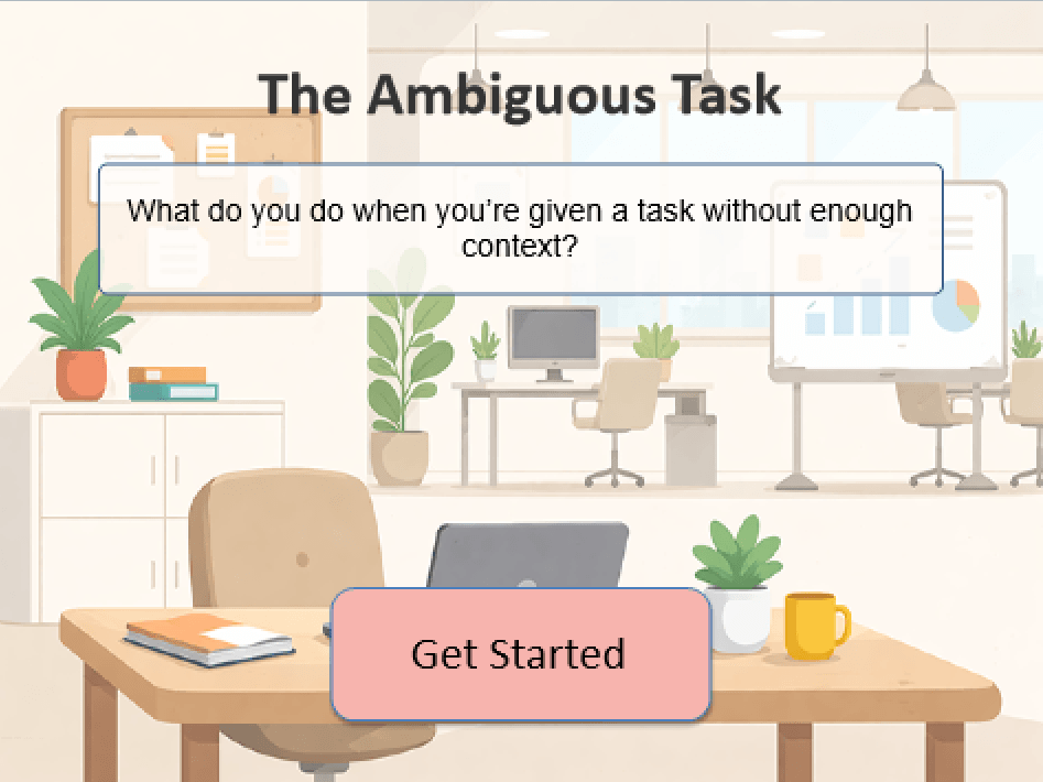
I designed a scenario-based simulation learning experience in Articulate Storyline 360 that places learners in an authentic workplace interaction.
Instead of presenting content first, learners are immediately immersed in a Slack-style conversation with their manager. They must decide what questions to ask in order to clarify a vague reporting request.
This approach prioritizes decision-making over information delivery, allowing learners to experience the consequences of their choices in a safe environment.
By the end of this experience, learners will be able to:
• Identify when a task lacks sufficient information
• Ask targeted, clarifying questions before beginning work
• Recognize how assumptions impact outcomes
• Apply a structured approach to reduce ambiguity
THE OUTCOME
More confident communication, faster ramp. By practicing decisions in a safe environment, learners build habits that translate directly to the job.
Impact:
• Stronger communication and alignment
• increased confidence in ambiguous situtations
• Faster time-to-productivity (6-8 weeks → 4-6 weeks)
• Reduced rework and manager intervention
Learners leave not just informed—but better prepared to act.
UNDERSTANDING THE ENVIRONMENT
DESIGNING FOR A FAST-MOVING, AMBIGUOUS WORKPLACE
Northstar Labs is a high-growth fictitious SaaS company where speed, ownership, and communication are critical to success. Employees are expected to operate with a high degree of autonomy—often making decisions with limited context and evolving priorities.
In this environment, success isn’t just about knowing the right answers—it’s about navigating uncertainty effectively.
KEY CHARACTERISTICS
• High-Growth Environment: Priorities shift quickly, and employees are expected to adapt in real time. There’s little room for hesitation or prolonged ramp-up.
• Cross-Functional Collaboration: Work spans teams and disciplines, requiring clear, proactive communication to stay aligned and avoid bottlenecks.
• Rapid Decision-Making: Employees frequently make decisions without complete information, balancing speed with sound judgment.
ACTION MAP
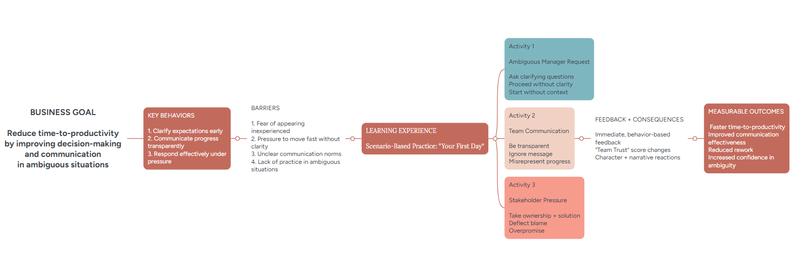
This experience was built using an action mapping approach to focus on what employees need to do, not just what they need to know. By identifying critical behaviors, uncovering real workplace barriers, and designing scenario-based practice with meaningful feedback, the solution directly supports faster ramp time and more effective communication on the job.
VISUAL MOCKUP
I moved into designing visual mockups in Figma to bring the experience to life. This phase focused on translating the narrative into a clean, intuitive interface that supports decision-making without distraction.
I explored multiple layout directions before landing on a design that felt both modern and familiar, drawing inspiration from common workplace tools like messaging platforms and task interfaces. This helped ground the experience in a visual language learners already understand, reducing cognitive load and increasing realism.
A key priority was establishing a consistent and cohesive visual system across all screens.
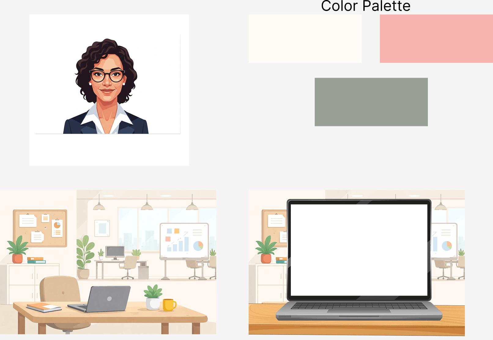
I developed a custom color palette using:
• Coral for emphasis and interaction
• Sage for balance and neutrality
• Cream as a soft, low-distraction background
These colors were applied consistently across UI elements, avatars, and backgrounds to create a unified look and feel.
To complement this, I designed a set of simple, non-photo realistic avatars to represent each character. Their minimal style keeps the focus on dialogue and decisions, while subtle expression changes help convey tone and emotional context.
The interface was intentionally designed to support quick comprehension and smooth interaction:
• Card-based layouts to clearly separate decisions
• Minimal, conversational prompts to maintain flow
• Rounded corners and soft spacing to create an approachable feel
Each element was designed to guide the learner’s attention without overwhelming them.
To reinforce immersion, I designed a subtle, abstract background system aligned with the color palette. Rather than detailed environments, these backgrounds use soft shapes and gradients to suggest a workspace while keeping the focus on the interaction.
This approach balances context and simplicity, ensuring the experience feels grounded without becoming visually heavy.
Once the visual direction was established, I combined the UI, avatars, and storyboard content into a high-fidelity prototype in Figma. This allowed me to refine interactions, test flow, and ensure visual consistency across all decision paths.
INTERACTIVE PROTOTYPE
FEATURES
CUSTOM VISUALS
I designed every visual element to reinforce clarity and immersion. I created abstract, geometric background visuals aligned with the project’s color palette (coral, sage, cream) to maintain consistency while keeping the interface uncluttered.
INTERACTIVE DECISION POINTS
The core of the experience is a scenario-based simulation. The learner is immersed in a simulated Slack conversation. Decisions are accompanied by contextual feedback, helping learners understand the real-world implications of their actions. This structure allows learners to practice navigating ambiguity safely, reinforcing behavioral skills instead of just content knowledge.
BRANCHING SCENARIOS & REPLAYABILITY
The experience features multiple branching pathways, allowing learners to explore different choices and see alternative outcomes. For example, a misstep in a communication scenario may create a follow-up challenge, while correct decisions progress learners along the narrative. This branching structure increases engagement and allows learners to experiment and reflect on multiple strategies.
ACCESSIBILITY FEATURES
I designed the visual and interaction elements with accessibility in mind:
• High-contrast color usage to support readability
• Clear, legible fonts and scalable text
• Keyboard-navigable buttons and decision prompts
• Optional screen-reader friendly labels for avatars and interactive elements
These considerations ensure that the experience is inclusive and usable by a wide range of learners.
GAMIFICATIION ELEMENTS
• Unlockable objects: quick reward and gratifcation
• Outcome Feedback: End-of-scenario summaries reflect overall performance, reinforcing learning and encouraging replay.
• Replayability: Multiple pathways and outcomes reward exploration and reflection, enhancing engagement and retention.
NARRATIVE IMMERSION
All scenarios are designed to feel realistic and relatable, simulating workplace pressures, cross-functional interactions, and ambiguity. Subtle visual cues provide emotional context, helping learners understand the tone of each interaction and the consequences of their choices.
RESULTS & TAKEAWAYS
I shared this project with peers and others in the instructional design community and received overwhelmingly positive feedback. Many highlighted the experience as engaging, realistic, and highly relatable, noting how accurately it captured the uncertainty of a first day on the job.
Viewers specifically called out the branching decisions and conversational tone as standout elements, emphasizing that the experience felt less like training and more like a real workplace simulation. Several noted that it effectively demonstrated how small communication choices can significantly impact outcomes.
FUTURE IMPROVEMENTS
There are several directions I would take this project with more time and resources:
EXPANDED AUDIO & IMMERSION
Feedback consistently pointed to the interactive nature of the experience as a strength. To build on this, I would incorporate:
• Ambient workplace sounds (notifications, background office noise)t
• Voice acting for key characters
These additions would deepen immersion and make decision points feel even more realistic and high-stakes.
DEEP BRANCHING PATHWAYS
While the current experience includes meaningful decision points, expanding the branching structure would:
• Increase replayability
• Introduce more nuanced consequences
• Allow for more varied narrative outcomes
I would explore adding “hidden” or less obvious paths that reward curiosity and experimentation.
EXPANDED SCENARIO SET
This experience focuses on a single “first day” narrative, but the concept could be extended to include:
• Multiple workplace scenarios
•Role-specific challenges (e.g., customer-facing vs. internal roles)
• Increasing levels of difficulty
This would transform the experience from a single interaction into a scalable learning series.
REFLECTION
This project pushed me to think beyond content delivery and focus on designing for behavior change. It gave me the opportunity to apply action mapping, build a fully interactive prototype, and experiment with creating realistic, decision-driven learning experiences. Most importantly, it reinforced that the most impactful learning happens when people are given the space to practice, reflect, and try again.